Let’s take a closer look at how we’re making one of so many frames in our motion comics cutscenes. I’d like to talk a little about the individual steps that go into a creation of one scene (or frame). To demonstrate this, I chose a scene from the introductory cutscene of a villain named Sullivan from our demo. According to the storyboard, in this particular scene we wanted to show a flashback from Jack’s past about his encounter with Sullivan.
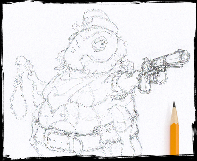
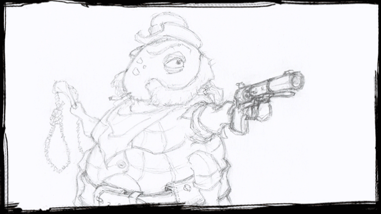
1. Pencil sketch
I’m always starting with a pencil sketch. The main reason for this is that I really enjoy classic drawing techniques and mostly because I’m not so skilled in drawing with the graphic tablet. It would be much more complicated and time consuming for me to achieve similar results right with the tablet. With pencil and paper I have a much better control over my drawings. For sketching I use classic HB pencil and for cutscene drawings a smooth 170g white paper (this affects mainly the ink lines later).
We are going to make a younger and less fat version of Sullivan (a fat greedy flea), as he is threatening and pointing his gun at Jack, who is off screen. For a more dramatic impact of this scene, I want to emphasize the perspective towards the viewer and use 3/4 angle for Sully aiming with the outstretched arm.
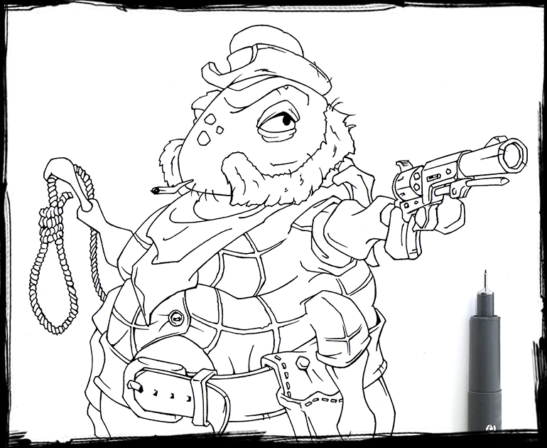
2. Contour lines
Next step is to do ink the contour lines. At this moment, there is no turning back. I am able to repair some small mistakes in the computer later, but mostly this is the finished outline of the picture as it is used in the game cutscene. For inking I’m using STAEDTLER pigment liner 0.1 and in some cases 0.3 size for different line weight to indicate light direction, but I try not to overdo it since we have strong hard shadows and high contrast for this purpose (we’ll get to that later).
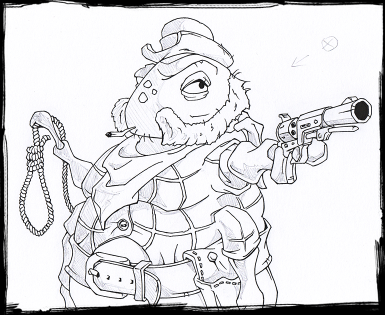
3. The light source
Now is the time to throw some light on things in the frame. As we have the sun as the only light source in the right side of the scene, it’s not so hard to define the darkest values.
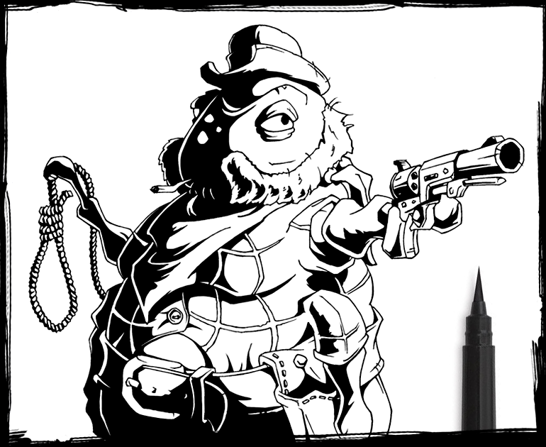
4. Shadows
Since I have the dark values defined from previous step, I’m going to do some solid black shadows. This is a comic book stylisation, so there is no problem to exaggerate shadows a bit and to use some “noir style” high contrast. You know, if it looks good it doesn’t have to be realistic :) This technique is similar to Mike Mignola’s style (but not nearly as good). For this I’m using PENTEL Pocket Brush Pen, which I think is the best human creation since sliced bread.
5. Flats
At this point we are done with analog and we are going digital, baby. We are making a computer game, so let’s use the computer a little bit. In this step I create flat colors inside the outlines. In flashback scenes we decided to use something like “sepia tint monochrome” color scheme to emphasize that this happened in the past so it’s a bit different from our colored “present day” cutscenes. From this point on I’m using my Wacom Intuos4 graphic tablet.
6. Highlights, lights and textures
Highlights are spots of light on objects created when they are illuminated by a direct light source. Highlights, same as shadows, are pretty important not only for defining the shape but also to create an illusion of a three-dimensional object.

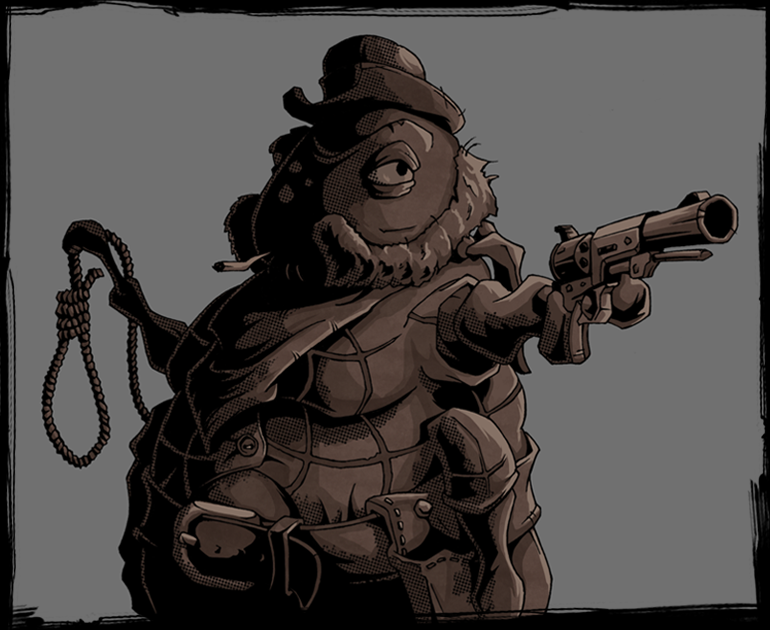
7. Halftones
Halftone is a technique that simulates tone with dots, varying either in size or in spacing and generating a gradient-like effect. This technique is used in print and since we are going for a old school comic book look or something that reminds old dime novels, it’s a nice little trick to do some middle shadow values. For this purpose I use a Polygonal Lasso Tool and a special halftone brush in Photoshop to create a pattern.
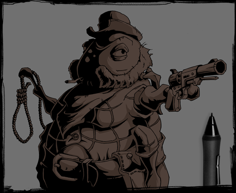
8. Reflected light
This is totally exaggerated reflected light of a very bright color, which looks more like a highlight on the dark side. And it basically serves the same purpose – it separates the object, in this case our bad guy Sullivan from the dark background by creating a higher contrast.

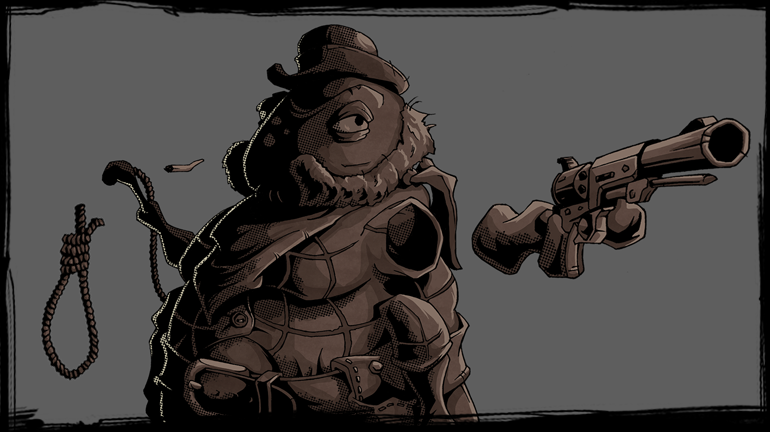
9. Preparing for animation
We are making a motion comic cutscene, so we need to animate at least some important parts of the frame. That literally means, in this case, to cut our Sully into pieces. At this point I decided to emphasize the perspective even more by changing the dimensions of the gun a little bit, so it looks to be even closer to the camera and more threatening.
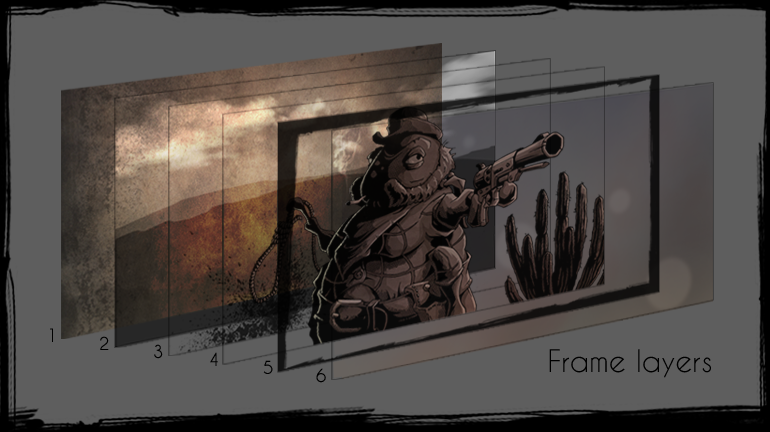
10. Making the scene
And as in any good movie, we are going to build a set. So we need some backgrounds, hills, clouds, props in the scene, environmental effects like dust and smoke and some other important things.
11. Animation
Then we put it all into After Effects, where my brother Ivan puts the whole frame into motion. This includes animating camera movement and all of the moving parts in a frame, adding particles and environmental effects, lighting, captions and finally voiceover, sound effects and music. But we’ll talk more about that some other day.
And that’s it for now. If you want to see what else we have in store, be sure to follow our progress on facebook, twitter, or instagram.


